Creative work

branding, video-editing and others

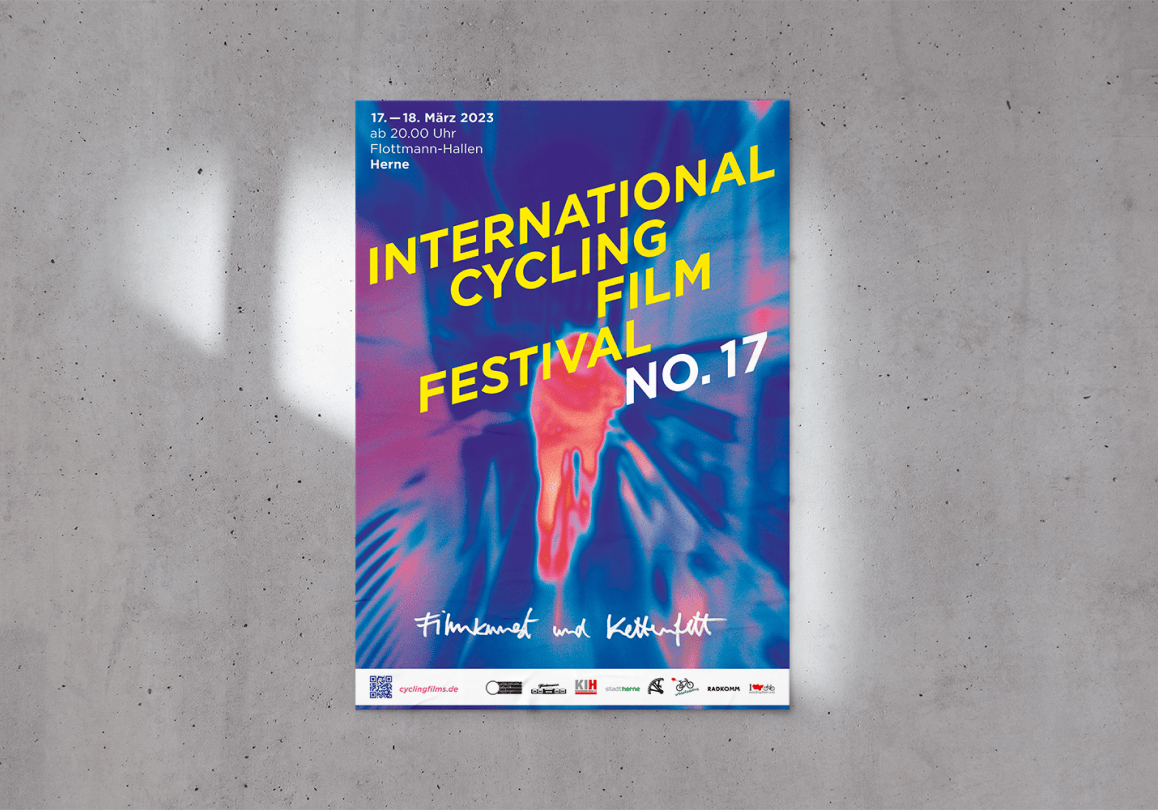
International Cycling Film Festival

Branding

As a university project, we participated in a competition to create a new identity for the Cycling Film Festival in Herne, Germany. My group won the competition and we were able to have that first experience of seeing our designs applied to this campaign for the 17th edition of the festival that toured the cities of Herne and Münster.

Press article

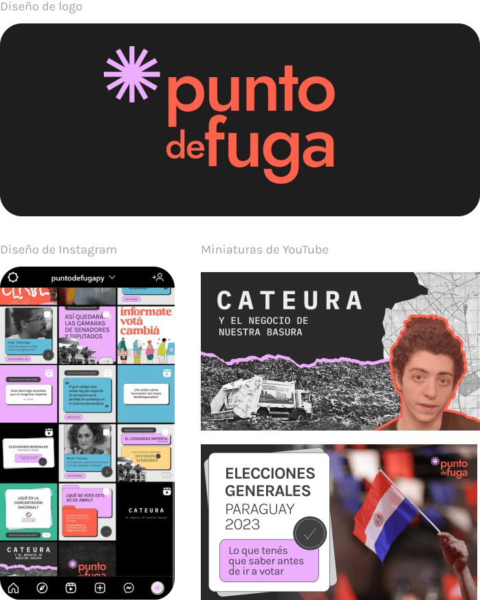
Punto de Fuga

Opinion & Podcast Platform

Punto de Fuga was born in 2021 as a need to create a space for the exchange of ideas and learning, we wanted to talk with people who could show us from different perspectives the way Paraguay works and learn from them.

We talk about political, cultural, educational and entertainment topics, among others. From the inside we do not want to limit Punto de Fuga, that is how it is becoming and being what it wants to be.

This project has enriched me enormously as a designer, since it is a place where I can experiment and apply the things I am learning related to the visual.

Get to know Punto de Fuga

CerveTour

Video-editing

As an excuse to learn more about craft beers in Paraguay, Punto de Fuga created the CerveTour. A mini-series of Youtube videos in which we visit four breweries and talk to master brewers.

We learned a lot about this field and tasted beers that, as Nicole Bibolini said in one of our visits, have nothing to envy to the international ones.

At the same time, I learned even more about DaVinciResolve for video editing and everything that goes with it (audio correction, color correction, etc.).

The 7 Paraguayan Myths

Book-design

As a semester project we designed Pop-Up books for children. In my group, we took the 7 myths of Paraguay as our theme. Nature, surrealism and fear surround these fascinating myths.

The creative process began with coming up with the concept of the book. Since the target audience was children, we had to adapt body features of the monsters present in the myths and adjust the narrative to make it more appropriate for them.

Once we established the concept and story, we immersed ourselves in exploring pop-up techniques to bring the pages to life.

We set out to achieve a minimalist design with lots of white space, so that the pop-up (3D) parts would stand out with their colors and beautiful textures.

To achieve this, we painted the backgrounds with acrylic paint, scanned them and finally incorporated them into the monster illustrations. This brought a more human touch to the project, generating a connection between the visual elements and the reader.

This project gave me immense satisfaction, it connected me with my country and my childhood, which I remember with great affection.